Redesigning Tactical Notifications When Everything Looks Critical
Soldiers were ignoring critical alerts because the system treated every notification identically. Through design thinking exercises with real operators and three rounds of on-base usability testing, we restructured the notification system around how soldiers actually prioritize information.
The Problem
The Tactical Airspace Integration System (TAIS) is an airspace management platform used by hundreds of Army personnel in active theater. When I joined the project, the team was porting the application from a legacy Linux desktop client to a modern web-based thin client, which created an opportunity to rethink the entire experience.
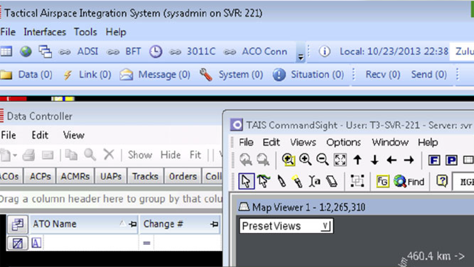
The legacy notification system had seven flat categories: Data, Link, Message, System, Situational, Received, and Send. When triggered, each category icon turned the same shade of red. A routine message receipt looked identical to an airspace violation alert. With dozens of notifications firing per day, soldiers had no way to glance at the interface and distinguish something that demanded immediate action from something that could wait.
Before
The result was textbook alert fatigue. Operators developed workarounds, ignoring the notification bar entirely and relying on radio comms to learn about critical events. In a tactical environment, a notification system that trains people to stop looking at it is not a usability problem. It is a safety problem.
Discovery
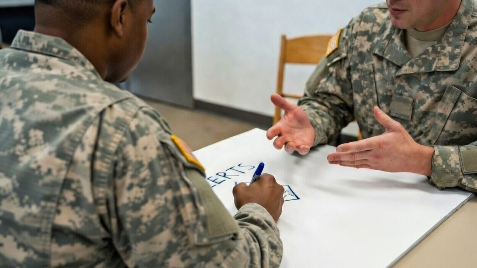
Rather than starting with design solutions, I brought soldiers into generative research sessions on base. The goal was to understand how they actually thought about alerts before proposing how alerts should work.
King for a Day
In small groups, soldiers were given a simple prompt: if you were king for a day and could change anything about the alert system, what would you do? No constraints, no feasibility concerns. This exercise gave operators, who in a military hierarchy might not feel comfortable directly criticizing an existing system, permission to articulate what was actually broken.
The raw output was revealing. Soldiers weren't asking for more features or better visuals. They were asking for the system to stop interrupting them with things that didn't matter. The themes that emerged became the foundation for the redesign direction.
Target Prioritization (Bullseye)
After the generative session, I ran a target prioritization exercise with the same groups. Each of the seven notification categories was placed on a bullseye diagram based on how critical soldiers considered it to their role. Three insights emerged that changed the design direction:
Communications didn't belong alongside tactical alerts. Send, Received, and Message notifications were actively resented as part of the alert system. Soldiers told us this wasn't email. They didn't want partner messages competing for attention with airspace events. The consensus was clear: pull communications into a separate, dedicated area.
Data alert importance varied dramatically by role. An airspace manager placed data updates at the center of the bullseye. A ground operator placed them at the outer ring. This revealed that the one-size-fits-all notification model was fundamentally flawed. Different roles needed different default priorities.
Some alerts were non-negotiable. When asked which alerts they would customize if given the option, soldiers drew a hard line around certain events, like an aircraft entering restricted airspace. These had to remain critical for everyone, regardless of role or preference. The system could respect user autonomy up to a point, but some things were always urgent.
The Design
The discovery findings led to three structural changes:
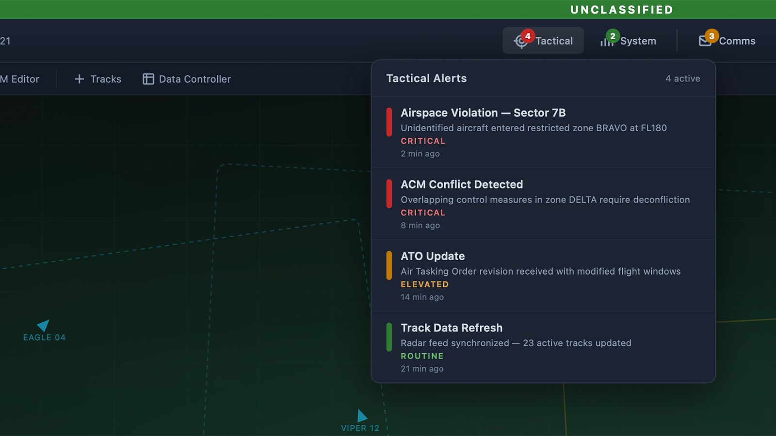
Consolidated seven categories into three. Communications (Send, Received, Message) were pulled into a dedicated messaging area, separate from the alert system entirely. The remaining categories were reorganized into Tactical/Situational (mission-critical events and intel updates), and System (connectivity, network status, infrastructure health). Each bucket mapped to a distinct mental model: "Am I in danger?", "Did someone message me?", "Is my system working?"
Introduced graduated severity badges. The binary off-or-red model was replaced with color-coded badges that communicated both count and urgency at a glance. A green badge meant routine items awaiting review. Yellow indicated elevated priority. Red signaled at least one critical alert in that category. Operators could now read the state of their entire notification landscape without opening anything.
Built a role-based customization layer with system-enforced locks. Operators could adjust default priority levels for alert types based on their role and mission context. An airspace manager could elevate data alerts; a ground operator could deprioritize them. But certain alerts, such as airspace violations, were locked at critical severity and could not be downgraded by any user. This design acknowledged that soldiers knew what mattered for their role while ensuring that safety-critical events could never be silenced.
After
Validation
The redesigned notification system was tested across three rounds of usability testing at an army base. Each round used realistic tactical scenarios where soldiers operated the system under simulated mission conditions, with multiple events happening simultaneously, time pressure, and competing information streams.
Each round included NASA TLX measurement on the notification task to capture cognitive workload across six dimensions, followed by post-task interviews that enriched our understanding of how operators were processing the new information hierarchy. At the end of each complete testing session, soldiers completed the System Usability Scale.
Workload Reduction Across Rounds
The TLX results told a clear story of iteration working. After the first round, the redesign was an improvement over the legacy system but still had rough edges. The customization controls weren't intuitive enough, and some operators weren't sure which bucket certain alerts fell into.
By the third round, after two cycles of refinement informed by both the quantitative TLX scores and qualitative interview feedback, the numbers had shifted substantially:
- Mental demand dropped from 68 to 41 across the three rounds. Soldiers no longer had to actively interpret whether a notification mattered. The visual hierarchy did that work for them.
- Temporal demand dropped from 58 to 37. The graduated badges eliminated the need to open and check each notification individually.
- Frustration dropped from 61 to 29. This was the largest single improvement, reflecting that the system was finally working with soldiers instead of against them.
Overall Usability
The System Usability Scale scores improved from 55 in the first round to 71 by the third, moving from below average to above the industry benchmark of 68. For a tactical military system where inherent complexity is high, crossing that threshold was significant.
The Radio Test
Perhaps the most meaningful validation came from the post-test interviews. During the second round, an observation confirmed one of our discovery insights: when a situational alert fired, several soldiers glanced at the badge, noted it was yellow (not red), and continued with their primary task. In the legacy system, that same alert would have turned the icon red, and the operator would have either interrupted their workflow to check it or ignored it entirely along with everything else. The graduated severity let them make an informed decision in under a second.
Impact
The redesigned TAIS notification system shipped as part of the broader thin-client modernization effort. The system remains in active use in theater today, over a decade after the redesign. The three-bucket architecture, graduated severity model, and role-based customization with locked priorities became the foundation for how operators manage information flow during missions.